Category Archives: interior design

How to get started with a creative career…

“My theory is that this lack of “starting” is attributed to two stupid things: perfectionism and fear.”

Emily Henderson

As I was doing some research this morning I stumbled upon a blog of Emily Henderson (LA based interior stylist, for those of you who like myself haven’t heard of her until this morning)  and got sooooo carried away watching her styling videos. You can check them out on your own here (there are some great decorating tips in them, just FYI ), however, this post is about a specific article  Emily wrote not too long ago  which resonates with two other books I am currently reading – “Big Magic” by Elizabeth Gilbert and “Show you work” by Austin Kleon.


How do you start a creative career, any creative career? From my own experience I know it is a change, a challenge and my answer is “Just start” and once you start you follow Nike’s slogan “Just do it”. For more elaborate discussion on the topic you can first read  “Big Magic” and then “Show your work” but key points are:

A) you need to overcome your fear, and

B) you need to be breaking out of your comfort zone daily and showing what you do, even if your work is far from being perfect.

Elizabeth Gilbert in her “Big Magic”  talks about how fear becomes a glass wall many people never manage to destroy to start doing what they have been wanting to do for years, sometimes their whole lives. She has an interesting way of talking about ideas as energy life-forms which come to a person waiting for the person to materialize them and if the person does not act on it, the idea picks itself up and goes to someone else who is more willing and ready to collaborate. I can totally relate to this because I have learnt for myself that if I have a recurring idea visiting me over and over, it just means that the idea is nagging to come to this material world through me. I have also seen how an idea that came to me and I never followed it through was implemented by someone else.

“Show your work” by Austin Kleon is about getting your work out there (still focusing on your work and not necessarily joining the glamorous  world of La Boheme) and showing what you do using social media, taking your audience behind the scenes, sharing the process of creating, telling the stories behind the work because each step is influenced by something that we hear, read, see, try, fail, try again, fail  again, try until you get it. Important point to remember is what needs to be shared is work or things related to work – not cats, dogs, lunches, babies, sunsets, selfies, but WORK!


Here is a full  post “My four cents on starting a successful creative career” by Emily Henderson which sums up key points for getting started.

TV and where to place it? How about nowhere?

TV, television
‘This is a very thought provoking program. The thought it’s provoking is: Why am I watching this garbage?’


I don’t watch TV. I haven’t watched TV since I was 16 and I stopped watching it because with my high school graduation exams and entrance exams to the university I physically had no time for it. That “preparation for exams” period lasted for almost a year and as we all know, we only need 40 days to create a new habit and 180 days for a habit to become “you”. Since I was well beyond 180 days period, TV’s and my way parted for good.

Having said that I notice that I have a struggle or, rather, an internal resistance,  to plan a space for TV in my projects. I have clients who occasionally ask me for a TV in their bedrooms. Ladies and gentlemen, bedrooms are meant to be used for something else! Moreover, having a TV in the bedroom is counter-productive to a good night sleep, in other words, your health!

I have also met people who placed a TVs in hallways – seriously, how badly are you afraid of missing the latest news from Syria?

TV in a dining room – I know it is a tradition and we need to respect traditions but family gathering around a table, talking about their day rather than staring at “the box” is a much older and healthier tradition.

TVs in cafes (which,  sadly, became  so popular in Uzbekistan) is a story  which requires a separate post but my 2 cents – you place a TV in a cafe when you have nothing else to offer other than a mediocre food paired with a mediocre entertainment. So what do you do? You place a TV on a height of 2 meters so everyone can watch it from any place.

Why am I writing this? Because I am working on an interior design of a small apartment and if not for TV, the space planning part would have been finished.

I am aware that people are different and we need to show tolerance towards each other. Moreover, the client’s wish is my command, so, what I think about TV  is really irrelevant when it comes to someone else’s house.

P.S.: full disclosure requires me to honestly state  that Internet is becoming as addictive as TV and I am guilty of this crime myself though I am working on it.

Karasu House II

This is the  second house (89sq.m.) being built on the same land lot as “Karasu House I”  in Karasu district of Tashkent, Uzbekistan.

While the bigger house (Karasu House I) is designed to be used by all family members and had to be more traditional to cater to the tastes of grandparents, this one is designed  only with  a head of a household in mind – a 40-something businessman living a very dynamic life with late work hours and international conference calls in the middle of the night.

In addition to the main living requirements for a residential space like a bedroom, a bathroom, a living room and a kitchen,  House II features a home office with a library and a hamam. Since the natural light only comes from one side of the house, to separate living room and home office zones wooden partitions were used to visually expand the space, to provide more natural light and better ventilation.

3D visualization of this project was done by Atabek Kasymov – thank you for your patience, especially with decoding my notes :))),  and optimism you brought to this project.

Floorplan | Karasu House II


View of the kitchen from the living area


Living area and office (in the background)


Kitchen
Kitchen


Bedroom
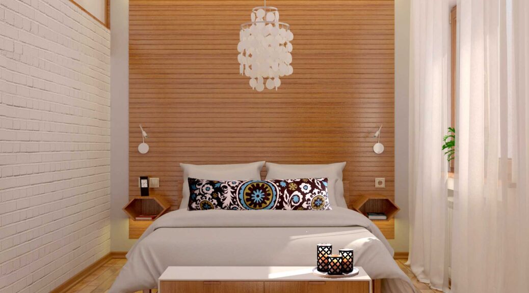
Bedroom features an all-natural  wooden accent wall as well as a brick  texture wall on the left to frame a window that allows a natural light into a master bathroom


Bathroom
Master bathroom featuring Tintoretto tiles by Keramin


Hamam | siink area
Hamam entrance featuring glorious Iznik tiles on a sink wall


Hamam
Hamam


Cold water well
Cold water well


Shower in a hamam area


Про обои на все стены …

Не могла пройти мимо этой статьи в индийском выпуске Architectural Digest, потому что вопрос того что делать со стенами всплывает на всех проектах частных домов и квартир, и очень часто мне приходится объяснять своим клиентам почему клеить обои на все стены –  это перебор.

Вот мнение экспертов  по этому поводу. Основная часть выделена желтым и на русский переводится приблизительно так:

“Люди часто перебарщивают с обоями и клеят их на все стены. Это просто размывает красоту обой, не говоря о том, что по цене они обходятся в целое состояние. Эксперты рекомендуют покрывать обоями только одну стену – возможно, акцентную –  для того, чтобы подчеркнуть истинную их красоту”

Voila!

Use of wallpaper
Architectural Digest India | Use of wallpaper


Main image is of “Graham & Brown Birch Heart & Tulip” Wallpaper designed by Marcel Wanders. The image of a courtesy of http://www.houseoffraser.co.uk/

Indiginous materials, genial application: BRICK

“Limits of whatever form, provide an ideal context for innovation. When faced with obstacles or adversity, our efforts to overcome them hone our creativity and help us find solutions  to global problems”

Writing on a wall, Expo 2016, Italian pavilion


You know how we, the humans, are finally realizing a mass damage we are creating by our mass production and are going back to eating local and using local materials?

I have been pondering on these thoughts for some time and while visiting Bukhara and Samarkand I saw how a basic construction material such as brick could be used in so many versatile ways as both a building material and a decoration material.  These images are a mix from 9th century architecture to newly renovated / built buildings. The key is – you have a basic brick and it is only human creativity and skills that turned it into something spectacular.

Samanid mausoleum
Samanid mausoleum


Winding brick staircase at Chorbakr


Alisher Navoi Library Room

“It is not what you know, it is who you know” saying is very true when it comes to how I got a chance to work on this project – an opportunity came through my yoga friend, our mats are right next to each other in a yoga class. One day before the beginning of the class he whispered “Hey, what do you know about Alisher Navoi?”. I jokingly whispered back “I know he was cool guy”.

Today is February 9, 2016 which in literary circles means 575th birthday anniversary of Nizamaddin Mir Alisher Navoi. To many he is known as a poetic genius who turned Turki (an old Uzbek language) into a literature language and put it on the same level as Farsi, which then had a prerogative of the only poetic language. In addition to being a poet, Navoi was a vizier to then ruler of Khorasan – an extremely high- ranking role in the State, calligrapher, philanthropist and a Sufi of Nakshbandi order. When I discovered the Sufi part (I am very curious about Sufism as a philosophy) my eyes lit up like Christmas lights and I knew exactly which way I was going to take this project.

There are many interpretation of the word Sufi. Many suppose it derives from the Arabic word “suff” (wool). However, given that the word is used to describe spiritually pure people, there is a supposition that it comes the Arabic “safa” (purity).

The project is to design Alisher Navoi room (105 square meters) in the National Library of Uzbekistan named after Alisher Navoi.

Main users of the library room will be:

  • students (majority)
  • non-student readers
  • researchers

On a day-to-day basis the room should be suitable for an individual learning, group studies (a hexagonal shape of desks was chosen to easily put a few desks together for a group work) and a more relaxed learning. As needs arise, the room will also be used for special events such as conferences, seminars and interviews with important guests. There should be an area for computers to provide users access to electronic database of the library and a small desk for a room coordinator. The client requested to keep the design contemporary with a use of old traditional decorative elements such as miniature paintings and geometric patterns.

The design concept for this project revolves around an idea of Sufi purity and multifaceted personality of Navoi. This room was designed to be a tour into a personality of Navoi which starts with an Introduction Wall  (on the right from the entrance), moves onto “Fani” and “Navoi” poetic walls, and then then takes us to a “Wisdom wall “, a collection of quotes by Navoi for those who are learning, maybe struggling and need a dose of encouragement. “Wisdom wall” is followed by a “Sufi wall” which is titled with Navoi’s own summary of Sufi philosophy:  “A way of being content with less”.

Floorplan

Alisher Navoi library room
Study area


Book storage area
Poetic walls and a book storage area


Wisdom walls
Wisdom walls and a computer area


accent wall render
Sufi wall


Relaxed learning area


*Note, as of a today, the interior design of the room  is approved but the wall text content  is in refinement process by  experts specializing on Navoi heritage. Implementation is scheduled for March – April 2016.


La Ménagère – a new retro restaurant in Florence by Q-BIC

La Ménagère, a historic 19th century building in Florence, Italy which back in the days was known as a number one store to shop for household items by Florentine women, has been  reincarnated as a retro restaurant.  The architectural part and the interior design were curated  by a Florence-based studio Q-BIC. Lights, which are an essential and the most mesmerizing part of the project, are by Karman, Italian studio specializing on light design.

Friends who are in Florence – definitely check it out and let me know how cool it is. I will definitely visit it next time I am in town 🙂

La Menagere | Florence, Italy

Full article on the project describing aspects of light design can be found  here.

Индустриально-скандинавский стиль “My Cafe” в Алмате

Алмата продолжает радовать погодой (сегодня даже жарко, около +35с) и своими кафе, а вернее их дизайном. Очередное кафе в индустриально-скандинавском стиле “My cafe” на Фурманова + Кабанбай Батыра. Все очень продуманно и красиво от дизайна меню до сustoms-made ламп. Обратите внимание на индустриальный смеситель в туалете.

P.S. Выяснила, что дизайн алматинского “My cafe” делала российская NB studio. Вот интервью с дизайнером: http://indress.kz/creative-people/vstrecha-s-dizaynerom-intererov-nataley-belonogovoy.html

imageimage image image

О разном за чашкой капучино в кафе “Льдинка”

Old new Soviet logo of a renovated cafe in AlmatyВ Алмате пахнет осенью. Еще раз убеждаюсь, что Алмата – город очень приятный: зеленый, чистый, относительно спокойный (Ташкент мне кажется более динамичным) и главное умно спланированный.  Дорожное движение напоминает цивильную часть Европу – пешеходов пропускают и  водят спо-кой-но. Короче, система штрафов делает свое дело . Ещё бы урезать количество машин и построить велосипедные дорожки, цены бы этому городу не было.

Встретились с подругой на обед, которая мне дала список заведений, которые я обязательно должна посетить. В списке кафе “Льдинка”, которое недавно открылось в новом скандинавской облике со старым лого. Та же подруга посоветовала погуглить творчество алматинского дизайнера Тимура Актаева, что вывело на следующую статью, которая очень была бы полезна 95% людей, которых я знаю.

Кафе "Льдинка" в Алмате Интерьер кафе "Льдинка"

A formula for decorating a nightstand

I saw this in the past, loved it but forgot to pin it. I re-discovered “the formula” today (courtesy of Melissa Boyer’s blog )  and am bookmarking it everywhere including my own blog. This is a formula for  decorating a night stand, end table, anything which has a purpose of creatively displaying things.

Those in Uzbekistan – pay attention to a blue ikat bowl – made in Uzbekistan, cherished around the world!

A formula for decorating a night stand or an end table. Image courtesy of Melissa Boyer interiors.


interiors-meredithheron-table
Image courtesy of Meredith Heron